The Meaning Behind the Circles of Life Logo 💚💛🩶
Ever wondered why our logo uses green, gold, and gray? Each color tells part of the same story, the seasons of life, from youth to wisdom.
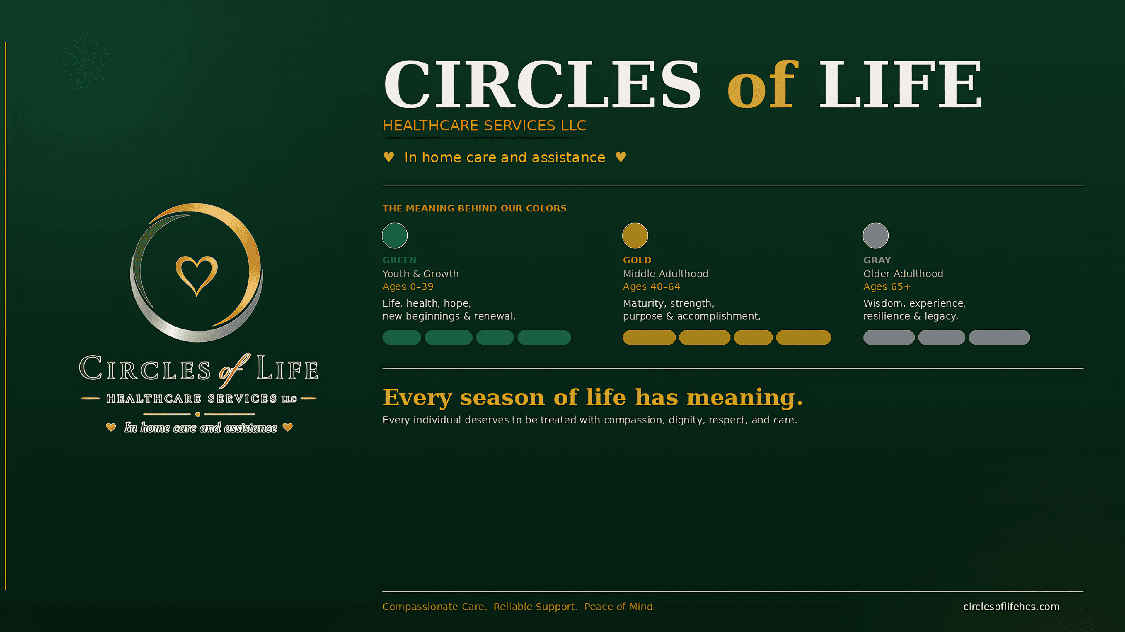
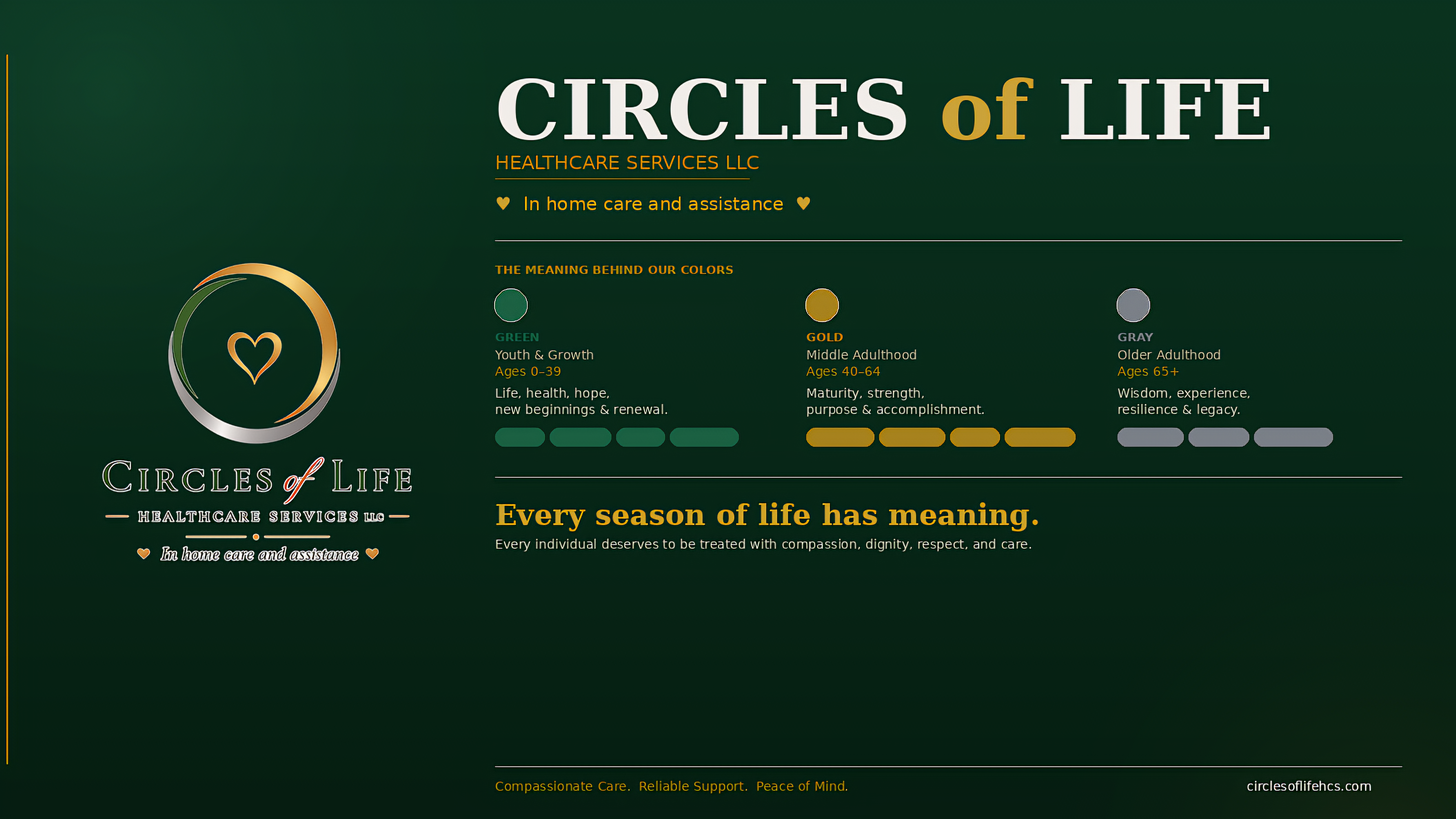
Have you ever wondered why Circles of Life Healthcare Services LLC uses green, gold, and gray in our logo? Each color was chosen to tell a story, the story of the different seasons of life.
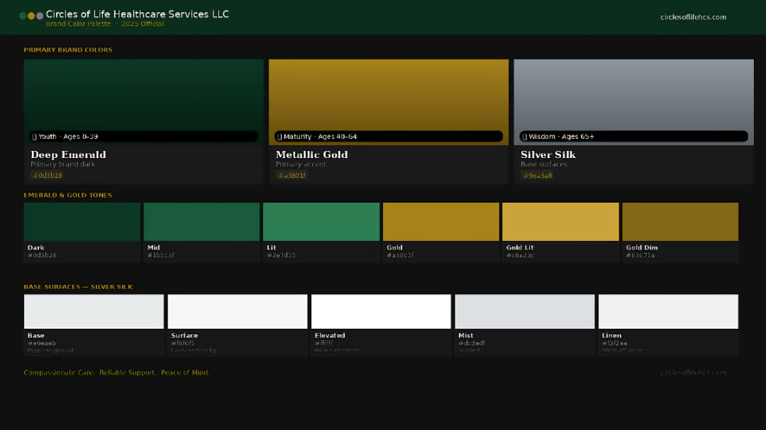
💚 Green – Youth & Growth (Ages 0–39)
Green represents youth, life, health, hope, growth, and new beginnings. Green is commonly associated with nature and renewal, making it a meaningful representation of the growing stages of life (Menatti & Casado da Rocha, 2016).
💛 Gold – Middle Adulthood (Ages 40–64)
Gold represents maturity, strength, purpose, accomplishment, and value. It symbolizes a season enriched by life experiences, responsibilities, relationships, and continued personal growth.
🩶 Gray – Older Adulthood (Ages 65+)
Gray represents wisdom, experience, stability, resilience, and legacy. Although graying is naturally associated with aging (Tobin & Paus, 2001), we see gray as something beautiful, a reflection of the knowledge, strength, and experiences gained through a lifetime.
Together, green, gold, and gray represent the Circle of Life, from growth, to maturity, to wisdom. The age ranges are symbolic and simply help tell the story behind our brand.
At Circles of Life Healthcare Services LLC, we believe that every season of life has meaning and every individual deserves to be treated with compassion, dignity, respect, and care.
Compassionate Care. Reliable Support. Peace of Mind.